
Building confidence, one lash at a time
As a UX Designer, I conducted user and market research, simplified Wink n Blink’s current style guide, and crafted wireframes and prototypes.
Challenge
Design a visually compelling and user-intuitive website for a real-world client to boost user engagement and drive business growth in the digital realm.
Outcome
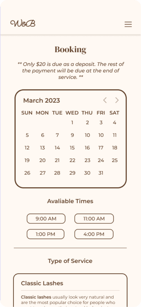
A website that highlights the online appointment booking feature and presents all essential information to know prior to an appointment.


Background
From Instagram to a website.
Wink n Blink is an at-home-based lash extension business started by UCSD student, Krystal Nguyen. She began her journey as a lash extension technician after experiencing an increase in self-confidence after receiving lash extensions herself. Now, Krystal aims to share this feeling with others.
Krystal primarily interacts with her clientele and manages appointments through Instagram. As her clientele grew, she recognized the necessity of a website to keep up with the demands of her business.
Objectives
During our exploratory meeting with Krystal, she outlined her priorities for the new website. We also discussed details about her current branding, potential local competitors, and the key factors Krystal personally considers important when searching for a new lash technician.
A functional and aesthetically pleasing website
Optimized information accessibility
Establish brand identity throughout site
Empathize
What do people consider when choosing a new lash technician?
Research Methods
Zoom interviews, user personas, competitive analysis
User Research
12 interviews
Demographics
Age 19-34
92% women, 8% men
We conducted 12 interviews with individuals of varying experience levels with lash extensions. Our goal was to understand what they look for in a lash technician and the type of information they want to know before booking an appointment.
We then conducted a competitive analysis of five beauty-related services in the greater San Diego area, specifically including Lash Bar, Wink n Blink’s most prominent competitor, due to its proximity to Wink n Blink’s home office. We examined how these competitors approached branding, functionality, architecture, and content on their mobile and desktop websites.

Competitor feature analysis

Define
Users want to know what they could be getting!
Based on our interview responses, I developed two user personas to guide our design process: a returning customer and a potential customer. The potential customer persona encompasses both lash extension users that aren’t native to Wink n Blink and non-extension users.


Other key insights
Make things easy to find
Users should be able to easily navigate the site and complete their goals.
Show your personality
Differentiate Krystal from competitors by showing her passion for lashing.
Establish trust with users
The website text should be friendly and make users feel welcome.
Show, don't tell
Images showcase value related to Krystal’s skills and experience.
Problem Space
How might we design an aesthetic website that boosts appointment booking efficiency while effectively communicating essential information to current and new lash extension users?
Ideate
Having a better understanding of the industry landscape, we started to design.
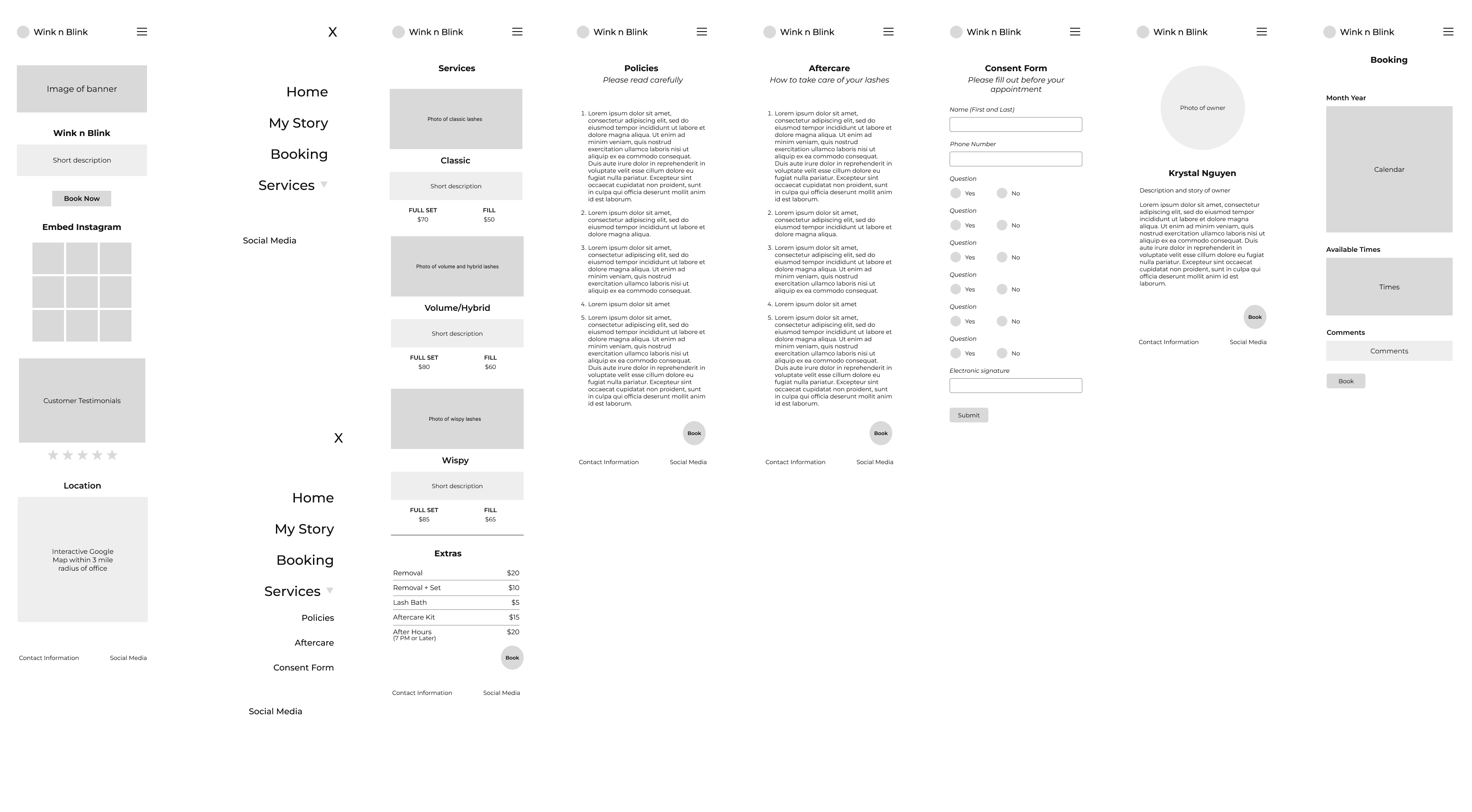
Despite some hiccups with our initial site architecture and appointment booking layout, we got our initial prototype done and moved on to a quick critique session with peers. After this critique session, we redesigned the structure of our nav bar, added informational pages under a new FAQ toggle section, and split our booking process into four pages.
Sitemap

Deliver
It was time to bring our ideas to life!
Wireframes
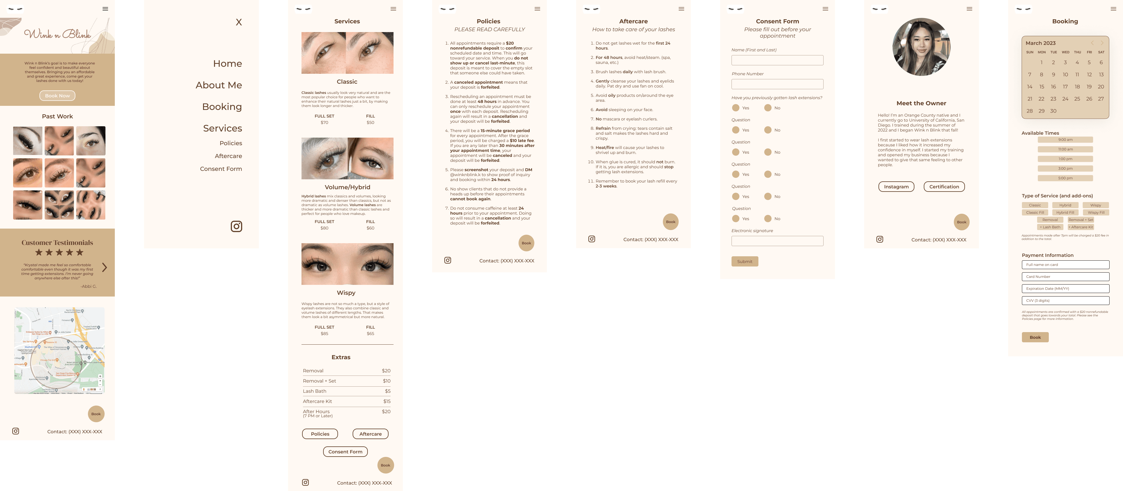
Mid-fidelity prototype
Testing
We tested 5 users’ ability to complete various task flows.
We tested our updated website design with three lash extension users. The feedback was generally positive, but some users found certain pages overly text-heavy and hard to read, while others felt the site was visually bland. In our latest iteration, we improved readability by increasing spacing and emphasizing key information about the appointment deposit and payment process.
Reflection
Working with a real client was highly rewarding!
This project showcased the importance of communication and flexibility, as well as their impact on the design process. Throughout our process, my team received insight into the flaws showcased in our prototype, which resulted in us reimagining various parts of the UI. Receiving insight from design professionals helped me to grow as a designer and to understand how to create an effective design.
I’m proud of my team for the work that we’ve done, despite it being the first time that we all designed a website. It was rewarding to communicate with a real client throughout the process and deliver a website design that she liked.
If we had more time, I would have loved to collaborate with Krystal to develop the website. Then, we would have been able to measure success by analyzing the growth of appointment bookings and the clickthrough rate to see if the website was reaching the right audience.